1st and 3rd Place IIDA Awards to Second Year Interior Design Students
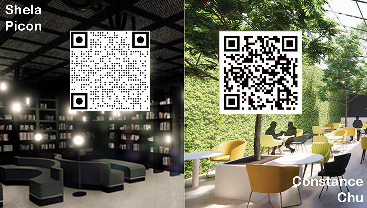
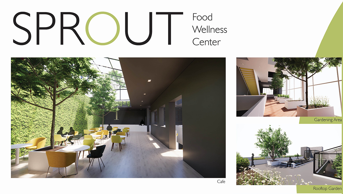
Interior design students Shela Picon placed 1st for Night Owl Cafe and Constance Chu for the Sprout: Wellness Center, work they completed in their second year interior design studio with Prof. Goldman. This is the first time the School of Art + Design has had a first place winner from the second year studio. The 2nd place winner was a rising senior from Drexel.
Goldman encourages all students to use virtual reality to dynamically visualize their design work in order to share it more effectively with viewers. Both students provided the judges with animated walkthroughs of their work, linked via QR codes.

John Cays, Associate Dean of Academic Affairs and Interim Director of the School of Art + Design agrees with this approach, “I am pleased to know the judges could appreciate the benefit this approach provides at least as it relates to presentation. The use of these tool combinations to integrate both visual and non-visual information is set to take off. The RTX platform and the next generation of GPU architecture will continue to unlock tremendous and relatively low cost, computational possibilities as we go forward.”
“The name “Night Owl Cafe" came from being a night owl myself. Everyone works differently, and I wanted to create a space that allows that work ethic to flow at any time of the day. The Night Owl Cafe is a space to recharge with a cup of coffee for the long night ahead, or to wind down after an all-nighter,” said Picon. “It was designed based on the Hal chair from Shiro Kuramata designed in 1986. The chair is entirely made out of metal with a slight elevated velvet seat and a metal mesh back piece. The materials that were most prominent in his work were acrylic, glass, aluminum, and steel mesh. Despite the dense materials he used, one of Kuramata’s design principles was to create objects that appeared light and transparent. The metal mesh used in the back piece of the chair became a prominent feature in the cafe's design as it is seen on the windows to filter in light, as a divider for privacy, the railings on the stairs and on the ceiling. Glass is used for furniture such as the library's bookshelves, cafe counter and two tables, one located on each floor. It is also used along the loft’s railing to create a sense of open space.”
Chu’s design for “Sprout” was inspired by the idea of food and wellness. “Sprout is a food wellness center promoting mood-boosting foods that help relieve anxiety and depression. The project is about food not only as a means of physical and mental health but also using food to find new small joys in the busy everyday. Sprout is a space about growth: in cooking, planting, health, and wellbeing,” said Chu. “The project’s organization is divided into two by an existing load bearing wall and is connected by three walkways. The staircase along the wall is the heart of the space to promote walking up steps for health, the elevator tucked into the far corner, and creates a center atrium of light infiltrating down. Solid stair rails define the staircase as a space of its own. A bright yellow accents the underside risers so its color changes from white underneath to yellow from the side, reflecting movement and dynamism. The center wall features a swirling line mural as visual movement connecting the floors. It is also a wayfinding map, starting at the front desk and following the way visitors go up the staircase throughout the building, mimicking a sprout bending and growing towards the top.”
